
LINKEDIN REIMAGINE
LINKEDIN REIMAGINE
CONCEPT • PRODUCT REDESIGN • INFORMATION ARCHITECTURE • 2025
CONCEPT • PRODUCT REDESIGN • INFORMATION ARCHITECTURE • 2025
ROLE
ROLE
Product Designer (UI/UX)
System + Flow Designer
Product Designer (UI/UX)
System + Flow Designer
TIMELINE
TIMELINE
5–7 day sprint
2025
5–7 day sprint
2025
DELIVERABLES
DELIVERABLES
Flows + IA
Key screens + states
Rationale notes
Flows + IA
Key screens + states
Rationale notes
SKILLS
SKILLS
UI/UX Design
Information Architecture
Interaction Design
Design Systems
Product Thinking
UI/UX Design
Information Architecture
Interaction Design
Design Systems
Product Thinking
OVERVIEW
OVERVIEW
Can LinkedIn feel calmer without losing momentum?
LinkedIn Reimagine is a self-initiated redesign where I rebuilt key parts of the product to reduce friction and improve signal. I focused on cleaner user journeys, simpler information architecture, and interaction decisions that feel predictable across core areas like discovery, connections, messaging, and profile.
LinkedIn Reimagine is a self-initiated redesign where I rebuilt key parts of the product to reduce friction and improve signal. I focused on cleaner user journeys, simpler information architecture, and interaction decisions that feel predictable across core areas like discovery, connections, messaging, and profile.
Core flows
Core flows
Redesigned the main journeys with fewer steps, clearer states, and more predictable actions
Redesigned the main journeys with fewer steps, clearer states, and more predictable actions
Design Rationale
Documented the key trade-offs and why each change exists, not just how it looks
Information Architecture
Re-structured navigation and hierarchy so users can find, act, and return without getting lost
Information Architecture
Information Architecture
Re-structured navigation and hierarchy so users can find, act, and return without getting lost
Re-structured navigation and hierarchy so users can find, act, and return without getting lost
Design Rationale
Design Rationale
Documented the key trade-offs and why each change exists, not just how it looks
Documented the key trade-offs and why each change exists, not just how it looks
THE REALITY CHECK
THE REALITY CHECK
Constraints I designed around
Constraints I designed around
Redesign sprint, not a research project
So I relied on product audits, pattern breakdowns, and clear assumptions instead of running primary research
A platform with competing goals
Redesign sprint, not a research project
So I designed with trade-offs in mind: creator growth, hiring, networking, and attention all fight for space.
So I relied on product audits, pattern breakdowns, and clear assumptions instead of running primary research
A platform with competing goals
So I designed with trade-offs in mind: creator growth, hiring, networking, and attention all fight for space.
Consistency is non-negotiable
So I stayed close to familiar LinkedIn mental models and improved clarity without reinventing everything
Scope had to be controlled
So I focused on a few high-impact areas and took them end-to-end, instead of redesigning every surface.
Consistency is non-negotiable
Redesign sprint, not a research project
So I stayed close to familiar LinkedIn mental models and improved clarity without reinventing everything
So I relied on product audits, pattern breakdowns, and clear assumptions instead of running primary research
A platform with competing goals
So I designed with trade-offs in mind: creator growth, hiring, networking, and attention all fight for space.
Consistency is non-negotiable
So I stayed close to familiar LinkedIn mental models and improved clarity without reinventing everything
Scope had to be controlled
So I focused on a few high-impact areas and took them end-to-end, instead of redesigning every surface.
Scope had to be controlled
So I focused on a few high-impact areas and took them end-to-end, instead of redesigning every surface.
Redesign sprint, not a research project
So I relied on product audits, pattern breakdowns, and clear assumptions instead of running primary research
A platform with competing goals
So I designed with trade-offs in mind: creator growth, hiring, networking, and attention all fight for space.
Consistency is non-negotiable
So I stayed close to familiar LinkedIn mental models and improved clarity without reinventing everything
Scope had to be controlled
So I focused on a few high-impact areas and took them end-to-end, instead of redesigning every surface.
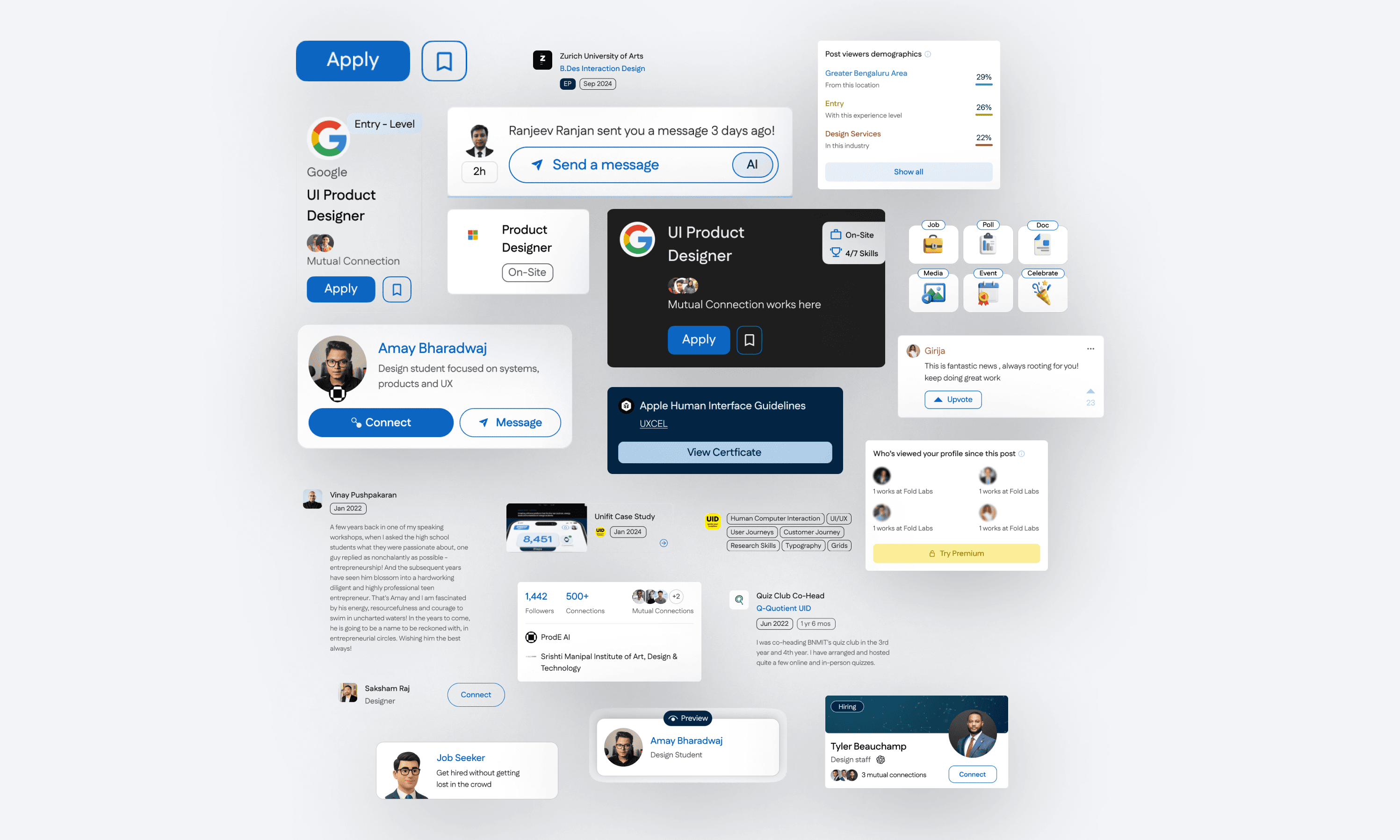
SOLUTION
SOLUTION
A calmer LinkedIn that helps you act, not scroll
A calmer LinkedIn that helps you act, not scroll
I redesigned key LinkedIn journeys to reduce noise and make intent clearer across the product. The goal was not a visual makeover, but a tighter system where people can post, apply, hire, and network with fewer dead ends.
I focused on clean information hierarchy, predictable patterns, and clearer feedback, so every major action feels obvious and recoverable.

Cleaner hierarchy
Breathable spacing and sharper card structure so the feed feels easier to scan
Better micro-interactions
Context-aware patterns like quick views and clearer states so users don’t lose their place
Flow-first redesign
Reworked core flows and IA across key areas like feed, profile, network, jobs, and notifications
Better micro-interactions
Context-aware patterns like quick views and clearer states so users don’t lose their place
Flow-first redesign
Reworked core flows and IA across key areas like feed, profile, network, jobs, and notifications
Cleaner hierarchy
Breathable spacing and sharper card structure so the feed feels easier to scan
Better micro-interactions
Context-aware patterns like quick views and clearer states so users don’t lose their place
Flow-first redesign
Reworked core flows and IA across key areas like feed, profile, network, jobs, and notifications
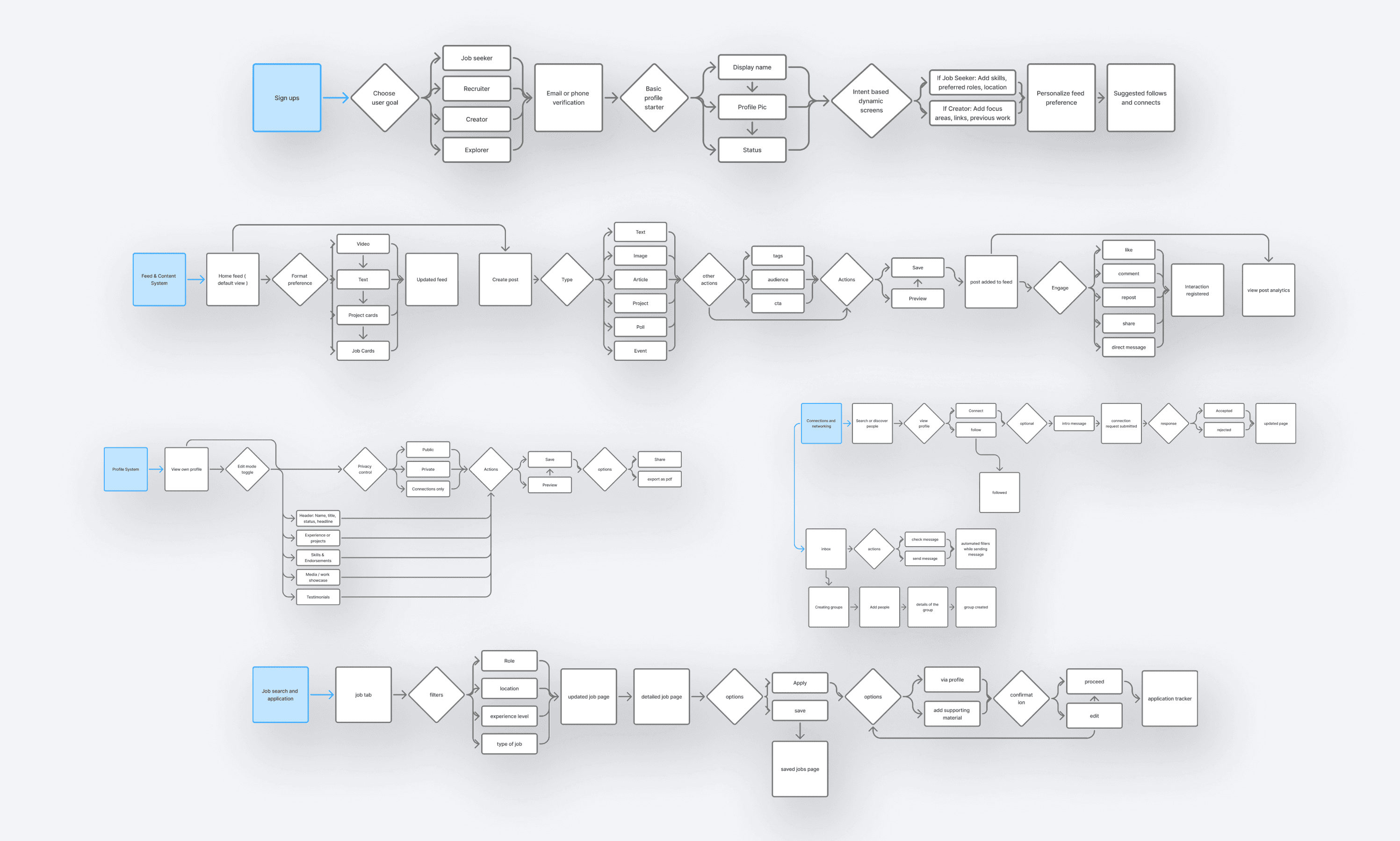
CORE FLOWS
CORE FLOWS
LinkedIn’s main loops, rebuilt
LinkedIn’s main loops, rebuilt
These are the journeys where LinkedIn either feels effortless or exhausting, so I redesigned them end to end
These are the journeys where LinkedIn either feels effortless or exhausting, so I redesigned them end to end
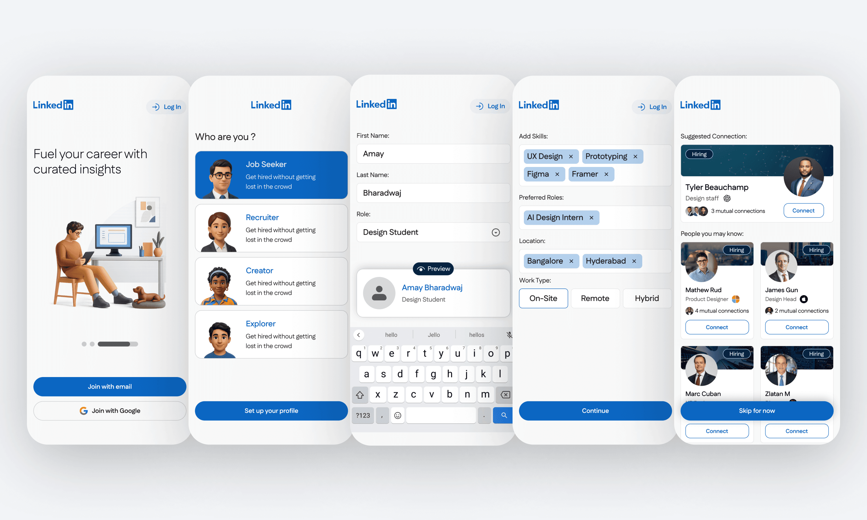
Setting up your LinkedIn
Faster setup with clearer defaults so users start with a usable profile and relevant feed
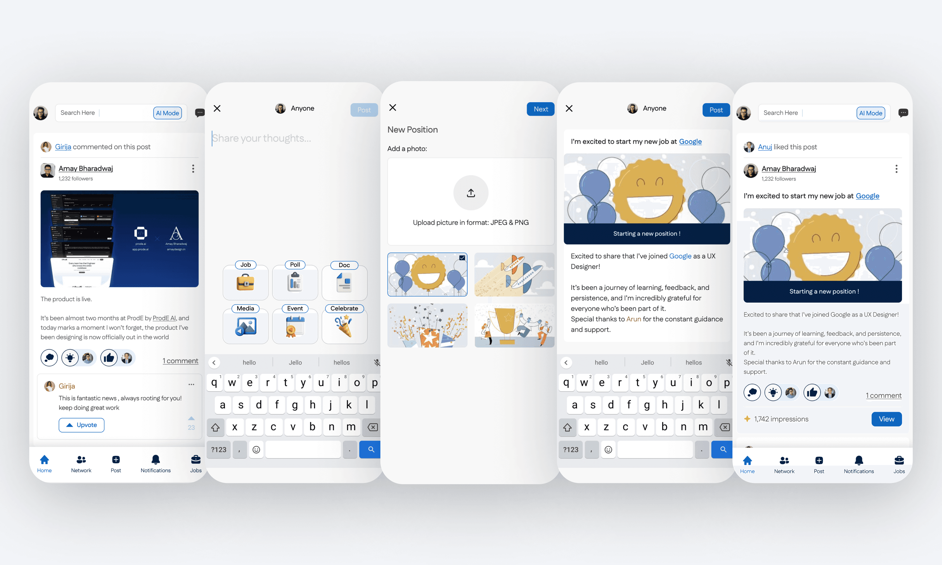
Creating a post
Built for fast posting without second guessing, while keeping preview and visibility clear
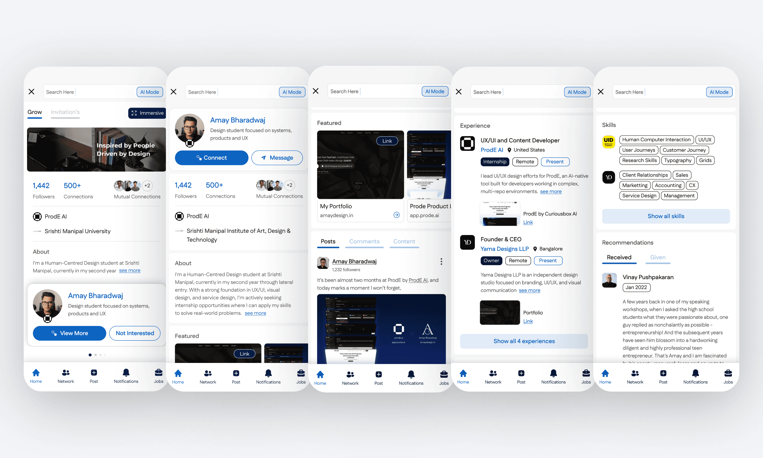
Exploring a profile
Structured scanning from headline to proof, with clearer sections and faster access to credibility signals
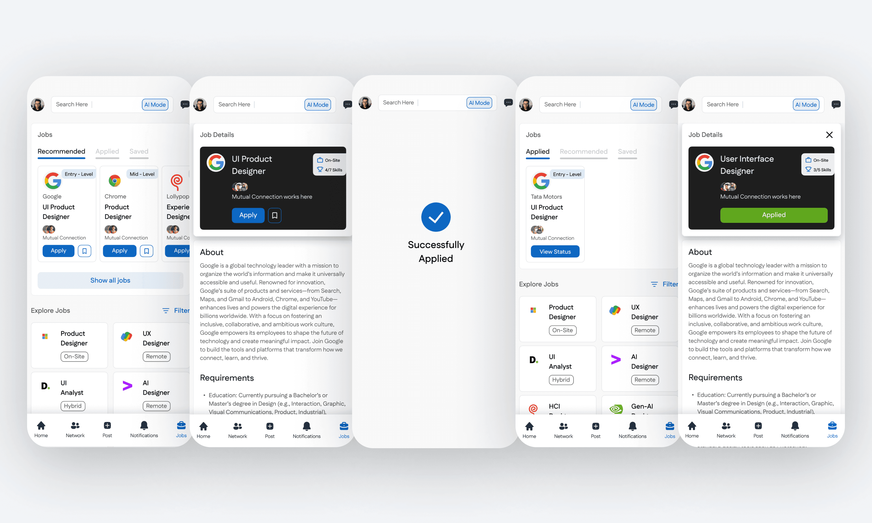
Finding jobs
A tighter loop from discovery to save to apply, with less clutter and stronger decision support
Creating a post
Built for fast posting without second guessing, while keeping preview and visibility clear
Exploring a profile
Structured scanning from headline to proof, with clearer sections and faster access to credibility signals
Finding jobs
A tighter loop from discovery to save to apply, with less clutter and stronger decision support
Setting up your LinkedIn
Faster setup with clearer defaults so users start with a usable profile and relevant feed
Creating a post
Built for fast posting without second guessing, while keeping preview and visibility clear
Exploring a profile
Structured scanning from headline to proof, with clearer sections and faster access to credibility signals
Finding jobs
A tighter loop from discovery to save to apply, with less clutter and stronger decision support
DESIGN DECISIONS
DESIGN DECISIONS
Design decisions for faster scanning and clearer intent
Design decisions for faster scanning and clearer intent
I focused on reducing cognitive load in the places people move fastest on LinkedIn: first-time entry, profile browsing, and feed reading. The goal was simple navigation, predictable interactions, and less visual clutter
I focused on reducing cognitive load in the places people move fastest on LinkedIn: first-time entry, profile browsing, and feed reading. The goal was simple navigation, predictable interactions, and less visual clutter

Onboarding is kept warm and low-friction: a simple story per screen, and sign-up stays one tap away without competing options
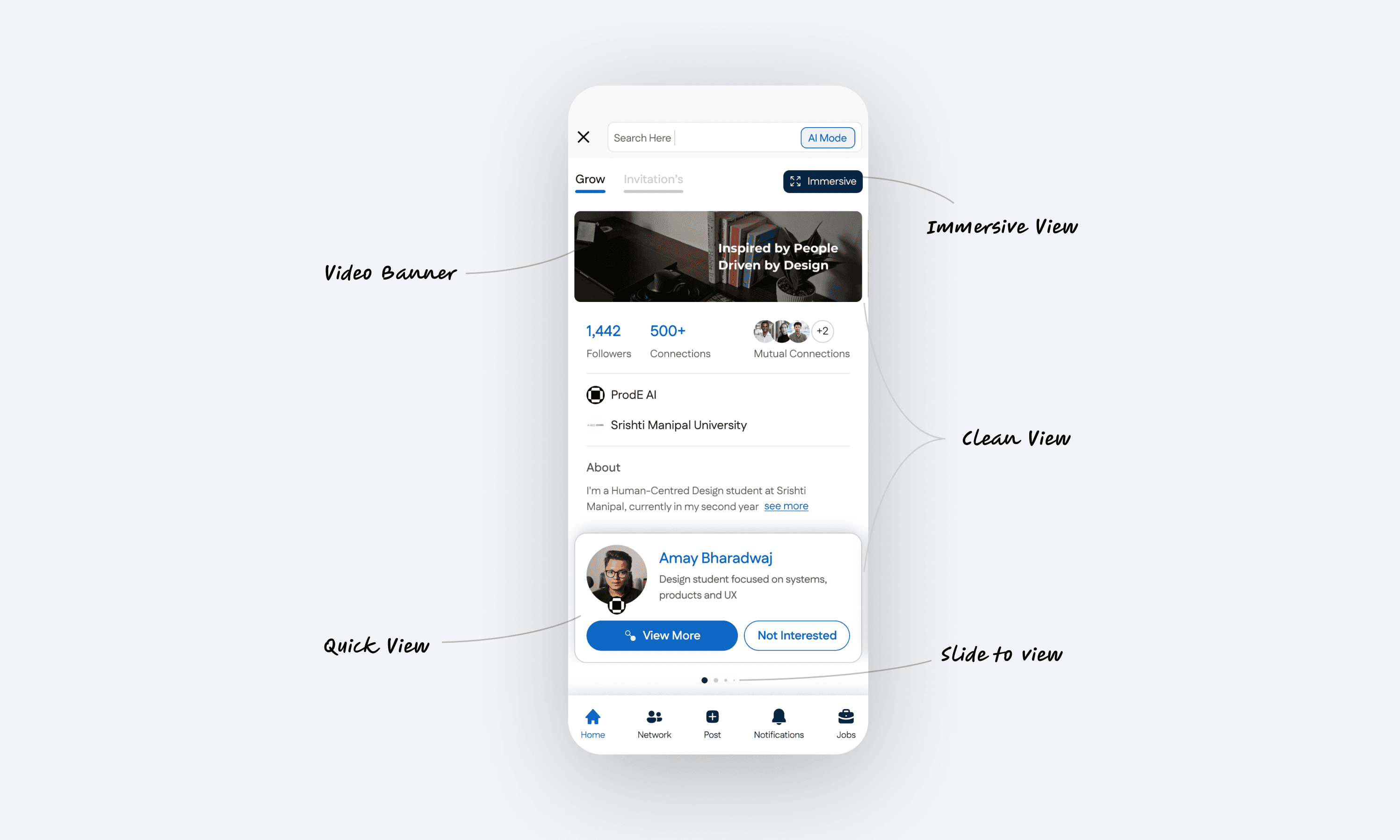
The profile is redesigned for quick judgment and deeper exploration: a clean default view, an immersive mode for content, and a “slide to view” interaction that keeps browsing fluid.
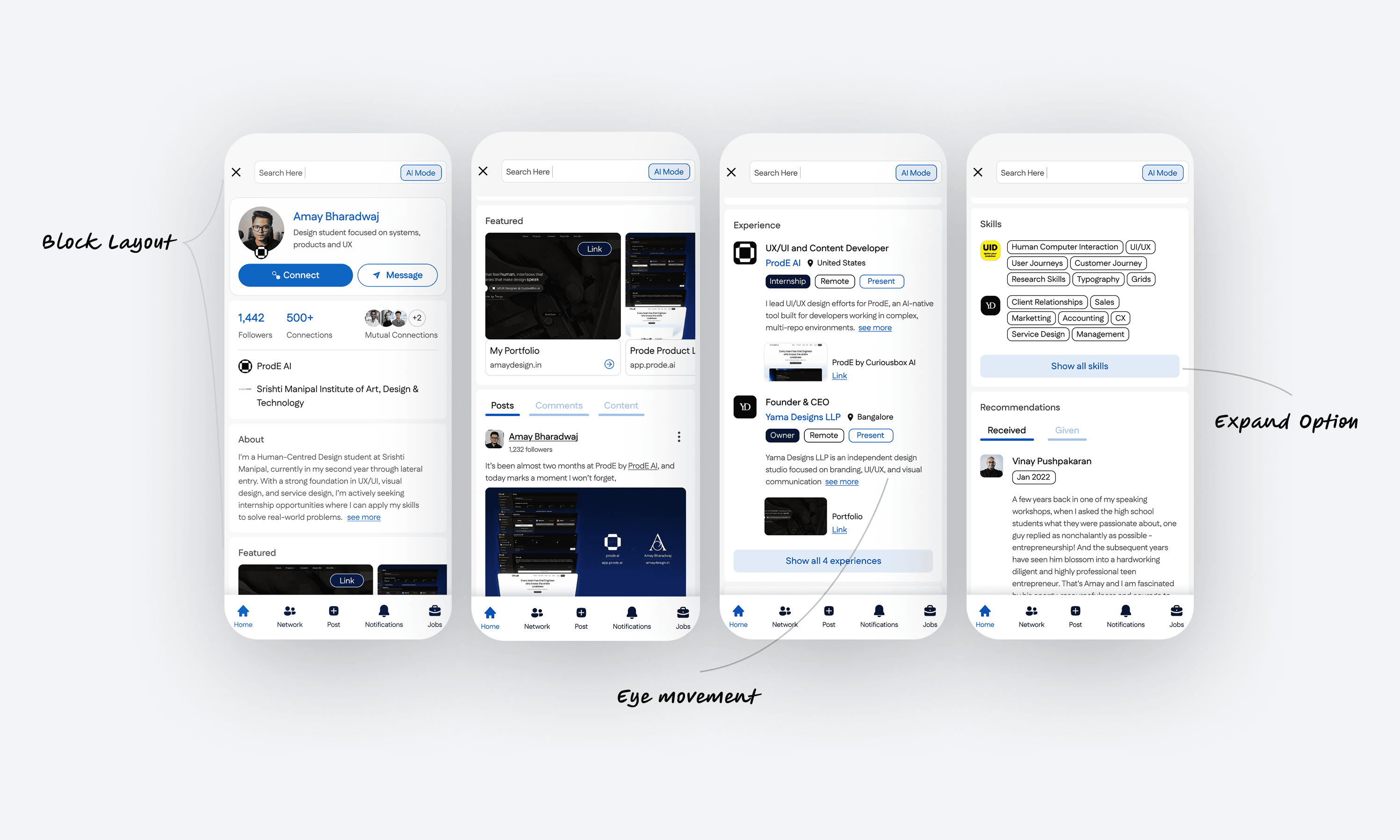
The feed is structured to support natural eye movement: block-based cards, clearer hierarchy, and expandable controls so users can scan first and open details only when needed

Connection is treated as a state machine, not a single button: Connect → Request Sent → Connected, with the option to send an impactful message using AI at the right moment

The Jobs experience is redesigned for faster filtering and clearer outcomes: a focused layout for browsing roles, dynamic states while actions load, and explicit success or error states so users always know what just happened
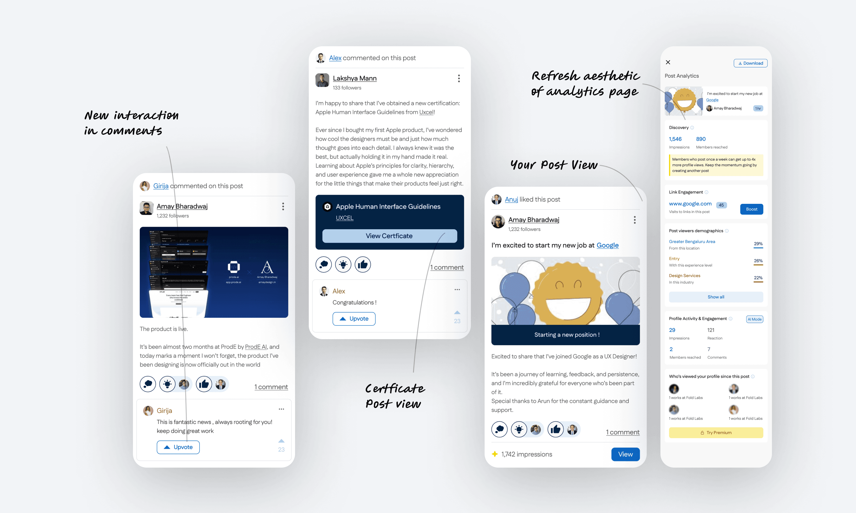
Posts are redesigned to support different content types and feedback loops: a cleaner comments interaction, a dedicated certificate post view, and a refreshed analytics page so creators can quickly understand performance without digging
The profile is redesigned for quick judgment and deeper exploration: a clean default view, an immersive mode for content, and a “slide to view” interaction that keeps browsing fluid.
The feed is structured to support natural eye movement: block-based cards, clearer hierarchy, and expandable controls so users can scan first and open details only when needed
Connection is treated as a state machine, not a single button: Connect → Request Sent → Connected, with the option to send an impactful message using AI at the right moment
The Jobs experience is redesigned for faster filtering and clearer outcomes: a focused layout for browsing roles, dynamic states while actions load, and explicit success or error states so users always know what just happened
Posts are redesigned to support different content types and feedback loops: a cleaner comments interaction, a dedicated certificate post view, and a refreshed analytics page so creators can quickly understand performance without digging
Onboarding is kept warm and low-friction: a simple story per screen, and sign-up stays one tap away without competing options
The profile is redesigned for quick judgment and deeper exploration: a clean default view, an immersive mode for content, and a “slide to view” interaction that keeps browsing fluid.
The feed is structured to support natural eye movement: block-based cards, clearer hierarchy, and expandable controls so users can scan first and open details only when needed
Connection is treated as a state machine, not a single button: Connect → Request Sent → Connected, with the option to send an impactful message using AI at the right moment
The Jobs experience is redesigned for faster filtering and clearer outcomes: a focused layout for browsing roles, dynamic states while actions load, and explicit success or error states so users always know what just happened
Posts are redesigned to support different content types and feedback loops: a cleaner comments interaction, a dedicated certificate post view, and a refreshed analytics page so creators can quickly understand performance without digging
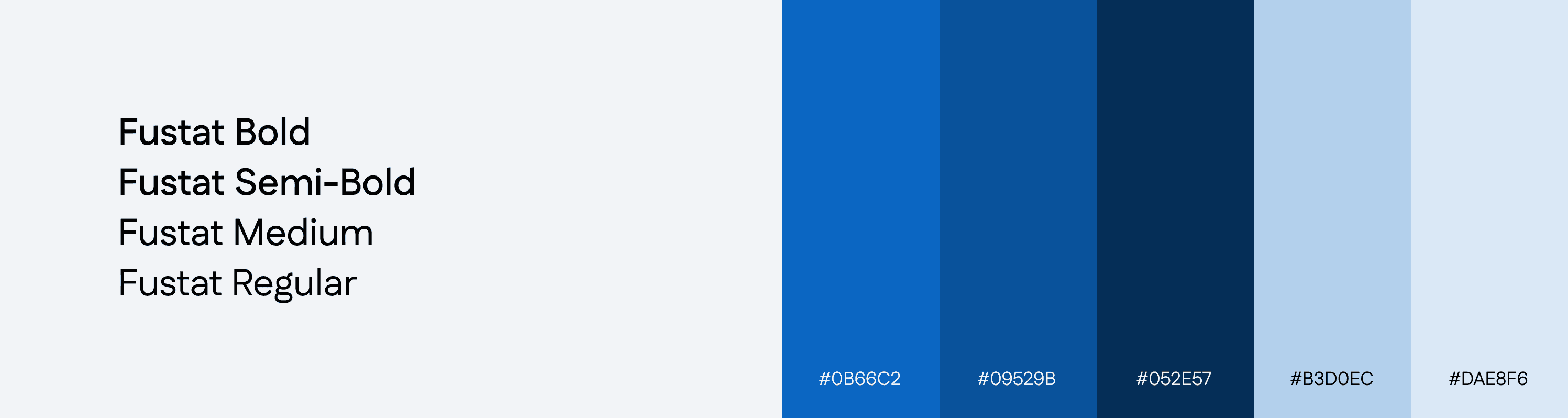
VISUAL SYSTEM
A UI system built for fast scanning
I kept the system lightweight and repeatable so core actions like connect, message, apply, and filter stay consistent across the app. The focus was speed, clarity, and predictable states rather than visual novelty.
I defined a small set of reusable components for high-frequency actions like connecting, applying, messaging, and browsing. Each component is designed to be scannable at a glance, with clear hierarchy and consistent interaction states
Designed for thumb speed
Primary actions sit where the thumb naturally lands. Components are compact, readable, and built for one-hand use.
Blue signals action, not decoration
Blue is reserved for primary actions and selected states so intent is obvious: Apply, Connect, Message, Continue
Context stays
visible
Designed for thumb speed
Profiles, job cards, and posts keep the essentials upfront so users decide without opening extra layers.
Primary actions sit where the thumb naturally lands. Components are compact, readable, and built for one-hand use.
Blue signals action, not decoration
Blue is reserved for primary actions and selected states so intent is obvious: Apply, Connect, Message, Continue
Context stays visible
Profiles, job cards, and posts keep the essentials upfront so users decide without opening extra layers.
States are explicit
Every action has a clear before and after: requested, connected, applied, saved, error. No ambiguous feedback loops
States are
explicit
Every action has a clear before and after: requested, connected, applied, saved, error. No ambiguous feedback loops
VISUAL SYSTEM
A UI system built for fast scanning
I kept the interface lightweight, readable, and repeatable across booking, tracking, and buy or lease. The goal was low confusion, fast decisions, and a consistent trust feel
I defined a small set of reusable components that stay consistent across booking, tracking, and buy or lease. The goal was predictable decisions, fewer wrong requests, and clear confirmation at each step.
Designed for thumb speed
Primary actions sit where the thumb naturally lands. Components are compact, readable, and built for one-hand use.
Blue signals action, not decoration
Blue is reserved for primary actions and selected states so intent is obvious: Apply, Connect, Message, Continue
Context stays visible
Profiles, job cards, and posts keep the essentials upfront so users decide without opening extra layers.
States are explicit
Every action has a clear before and after: requested, connected, applied, saved, error. No ambiguous feedback loops
REFLECTION
REFLECTION
What I learned
What I learned
Friction compounds in small moments
Friction compounds in small moments
The biggest UX wins came from removing tiny pauses: clearer buttons, fewer competing options, and cleaner hierarchy. Small reductions in friction add up across a feed-heavy product.
The biggest UX wins came from removing tiny pauses: clearer buttons, fewer competing options, and cleaner hierarchy. Small reductions in friction add up across a feed-heavy product.
Constraints can improve choice
Constraints can improve choice
Instead of giving more options everywhere, I focused on tighter defaults and clearer paths. When actions are frequent, too much flexibility becomes noise.
Instead of giving more options everywhere, I focused on tighter defaults and clearer paths. When actions are frequent, too much flexibility becomes noise.
Consistency is the real UX feature
Consistency is the real UX feature
In a product this broad, trust comes from repetition. If Connect, Apply, and Message behave the same everywhere, users stop re-learning and move faster.
In a product this broad, trust comes from repetition. If Connect, Apply, and Message behave the same everywhere, users stop re-learning and move faster.
Design is negotiation
Design is negotiation
Most decisions were trade-offs between clarity, density, and familiarity. This project taught me to choose what to keep, what to simplify, and what to leave untouched so the redesign still feels like LinkedIn.
Most decisions were trade-offs between clarity, density, and familiarity. This project taught me to choose what to keep, what to simplify, and what to leave untouched so the redesign still feels like LinkedIn.